-This is the design for the open card for the booklet printed on brown recycled stock.
- Start of developing the logo I really dont like the type face I have realised I really dont want it black and white and needs to represent more of the brand
-The image below i produced for the kids pack its a postcard so that the children can write to the countries or write them to family and friends to make them aware of what feel good drinks are doing.
-Logo development for this is was a little bit of experimenting at first then I decided I wasn't changing the brand or the brand values so it was important to keep it simple using the same type face which is appropriate to the market there selling at anyway I just chose to add from my development a hand holding a growing seed. This representing the children workers of each country and their appreciation for new life and how they care for the crops as they are valued so much to them.
-A poster which could be added to the special promotional packs which will be sent out to schools, not only will this be promoting the drinks in schools which I think they would be appropriate for with the healthy eating campaigns across UK and other countries. Its a good lesson to teach kids and with me including and educational factor of a map of where the fruits come from and information how the drinks made would make a fun lesson plan!
-The label idea just changed the logo slightly to the giving logo I have designed and changed the usual colour of feel good background. This was just to clarify that you are buying a bottle which will be contributing money to the aid depending on what flavour you bought goes to the country where the main fruit was sourced.
-In conjunction with this I will be designing a small tag wrap around to also be attached to the neck to reiterate the idea and cause.
-Experimental poster ideas a very realistic visual idea of the bottle containing 100% real fruits... although i like the visual aspect its very cliche and no doubt been done before so im unsure wether to use it.
-Final spreads done ready to print and cut down.
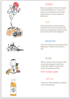
- For the feel good brief I wanted it to be a more of an educational pack for children, not only learning about the educational factor of how the drinks are made where the fruit is sourced from and how it gets from picked to bottled. Also the nature of giving something back charitable work and the overall concept of being a good citizen and realising the values of giving a gift in return.
-Below is the booklet I have designed to be attached to the carrier box which just contains information in a light hearted colourful manner using illustrations and simple language. I wanted to portray feel good as a cute small almost naive sounding company even though they are not naive yet it is easier for the consumer to form a bond. People like to deal with people not brands so this is what i have tried to do here.
-This will be spreads so a relative small booklet with a brown recycled card wrap around.


No comments:
Post a Comment