This box is so simple yet with the use ofwater colour really expressed beauty and luxury if I wanted to use ascetate for the inofrmation there could be a plain box with a water colour patch underneath.

Mac altering the colours of the packaging influenced by the products inside


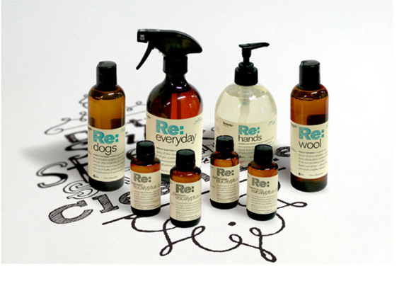
I really like the simplicity of these illustrations and they are straight onto the product I really like this idea saves un used boxes and packaging looks more effective may need to have an experiment into this.
Although dont want to mock up the whole range so depending on how the colours print onto that may not have as much impact.


very clean cut and professional yet to me just doesnt look like a cosmetics range at all.


No comments:
Post a Comment